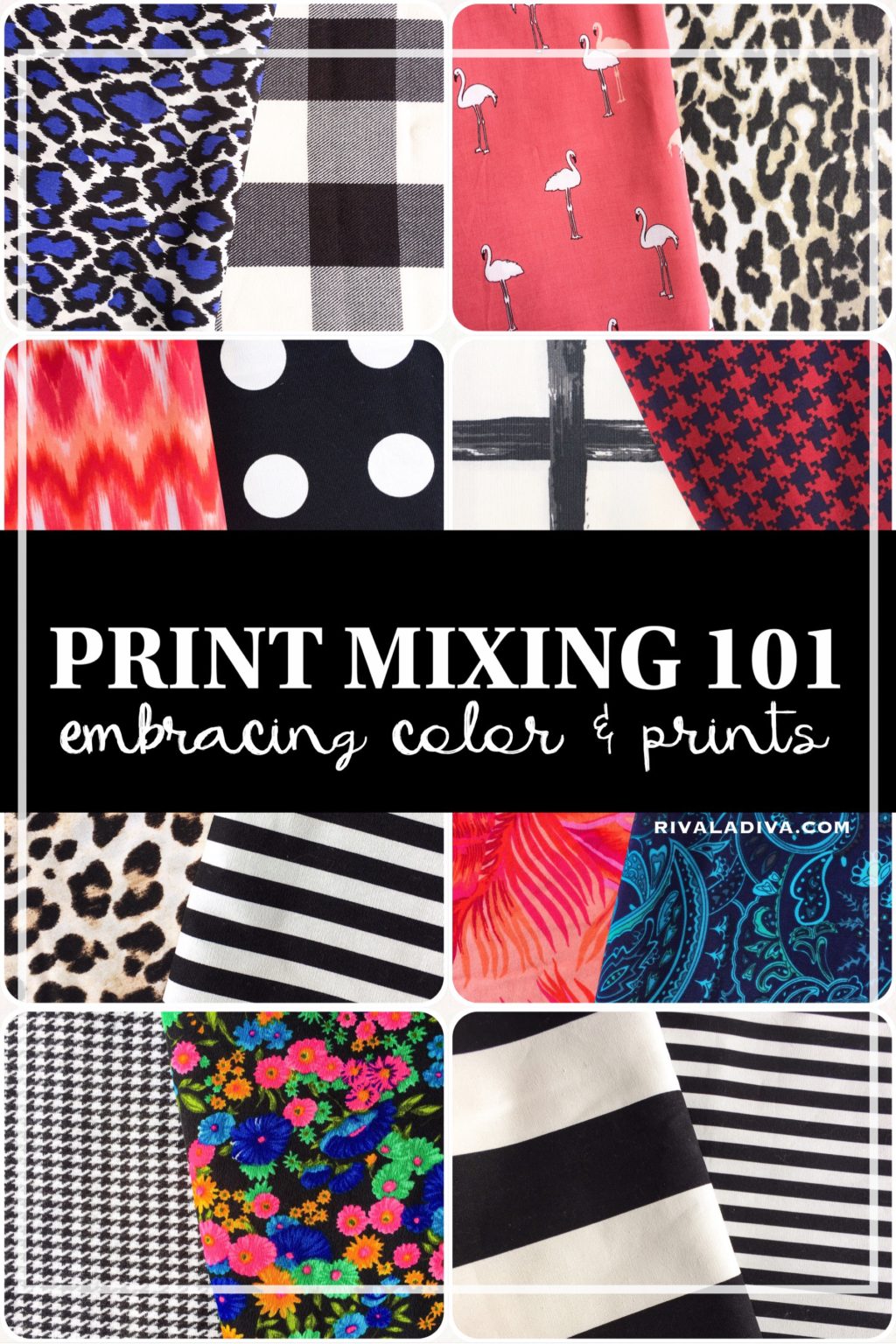
Print Mixing 101 – Embracing Color and Prints
One could say I’m obsessed with color and print mixing. One of my favorite seasons of Project Runway was the third one with Uli Herzner. Uli was one of the first people I remember introducing me (via tv) to the wonderful world of print mixing. Each week, my husband and I were in awe of her mixing skills and I had wished my brain could think more like that. For a long time I thought you either had it or you did not. Back then, I did not “have it” but I have practiced with it over the years and now feel pretty confident. When I mix print and colors, the comment I get from most people is how difficult it is to give this trend a try for themself… LET ME BE CLEAR: this print ix skill did not come naturally. I experimented a ton to “make it work”. But, I’m willing to share some of the secrets I know to be true and hopefully it will serve as inspiration to experiment for yourself in the future!
1. Neutrals
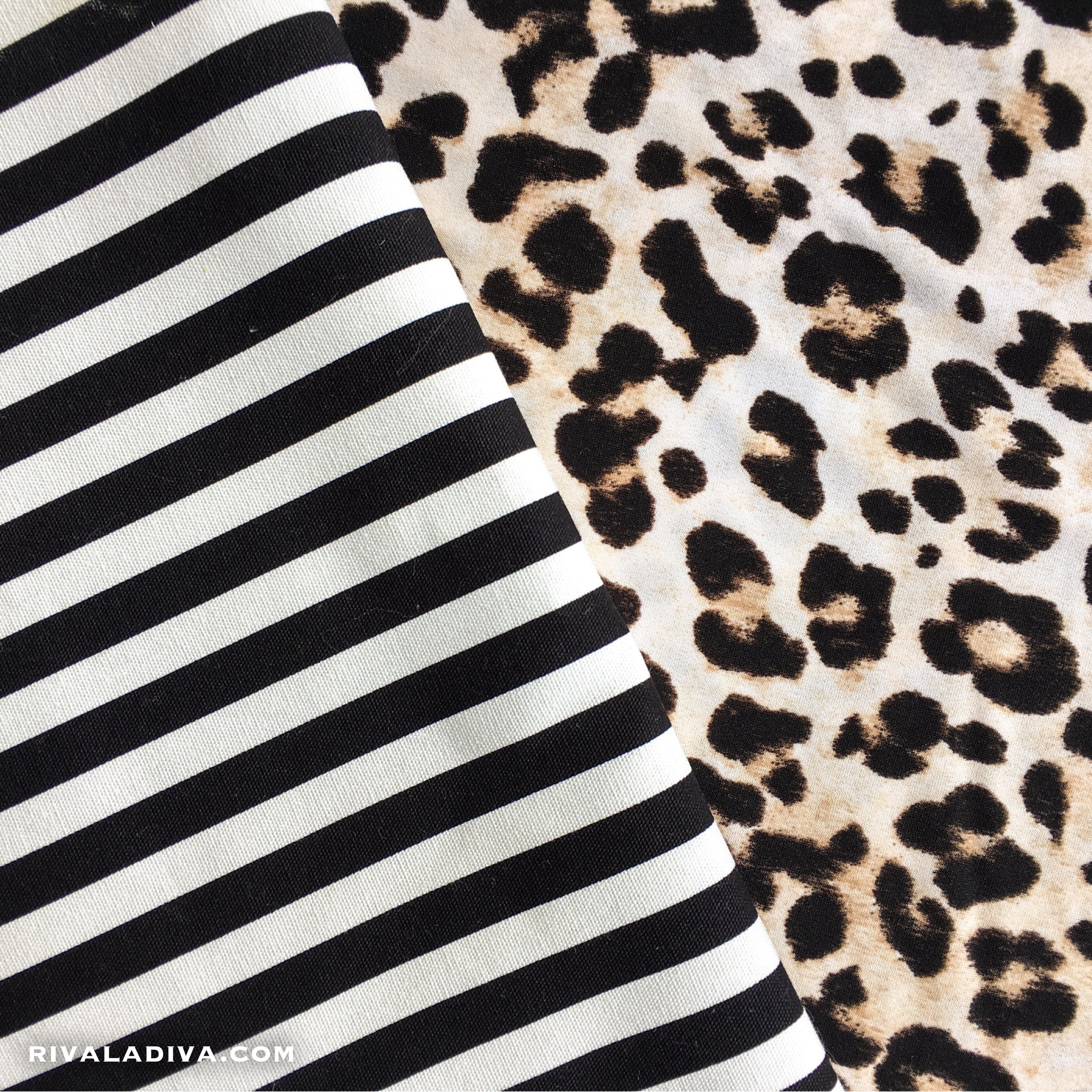
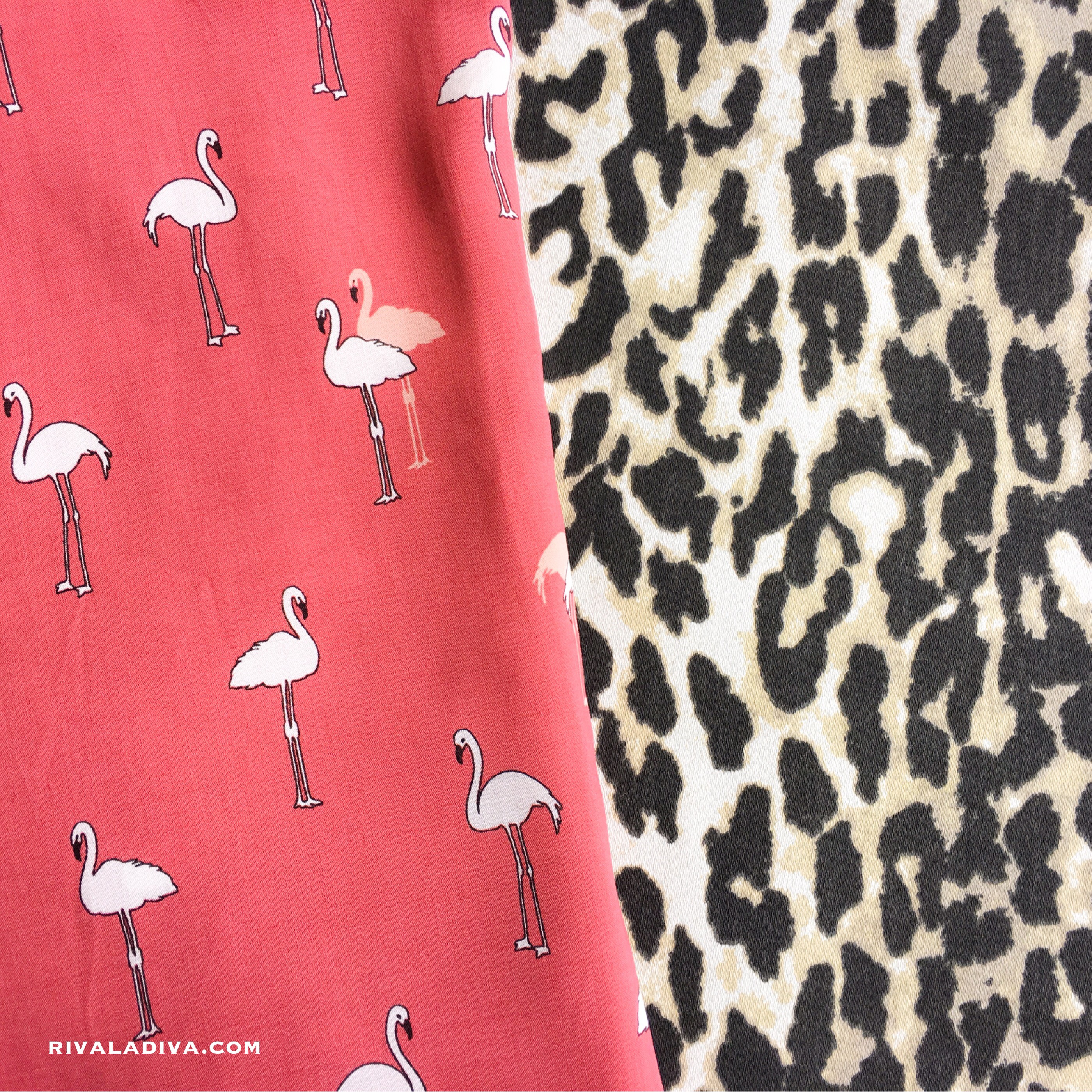
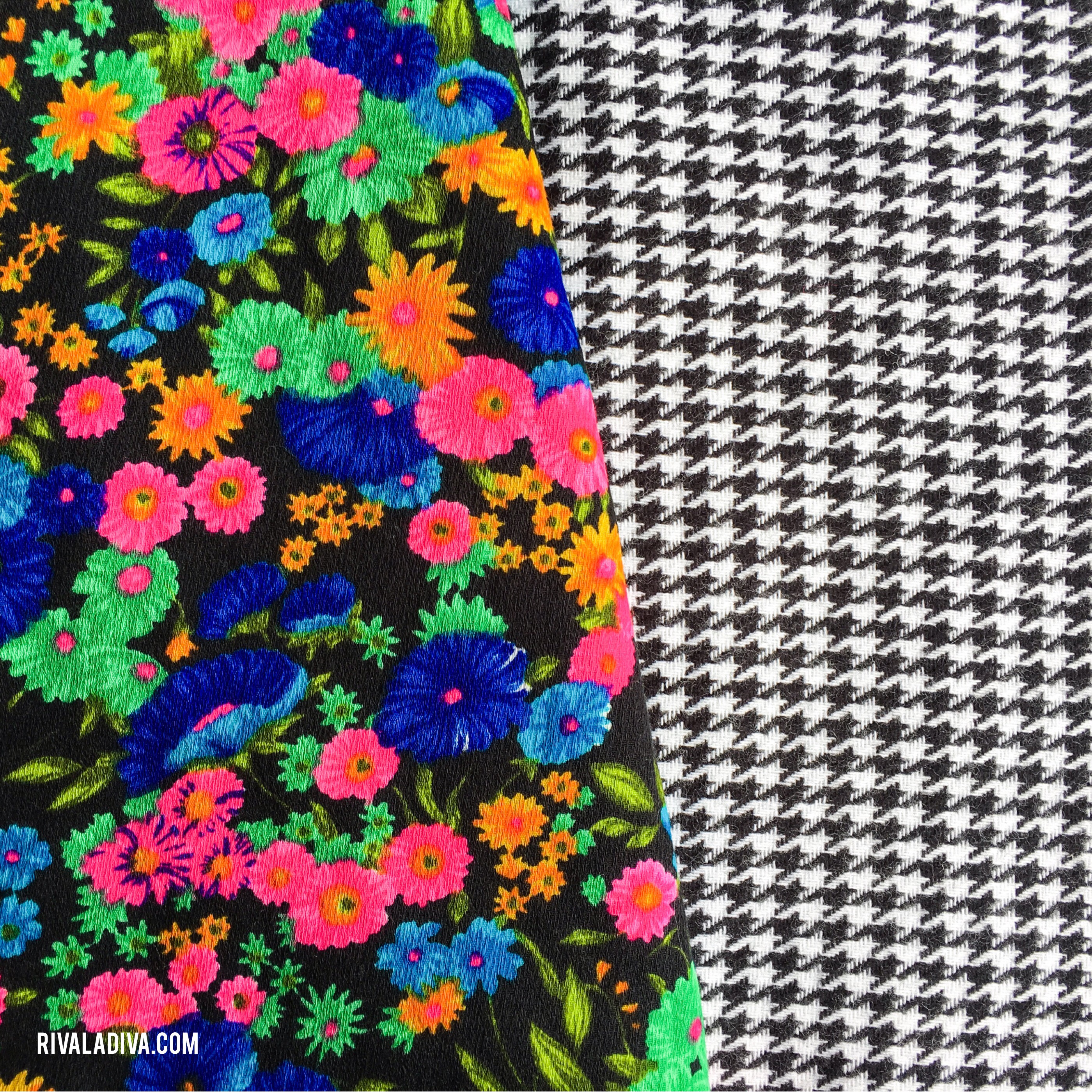
Neutrals are the safest way to enter the print mix world and those would include colors like…. shades of brown, cream, white, grey, and black. They are more on the safe side – mix them and never look back! The photo below is a great example, both are neutral in color but quite contrasting in print. Another great I have done this is a gingham and leopard post I did a few years back, CLICK HERE. And the biggest neutral of them all is LEOPARD. If you are a afraid to wear leopard think of it as a pair of khaki pants, a white shirt or black ballet flats – it works with everything.
2. Black and White
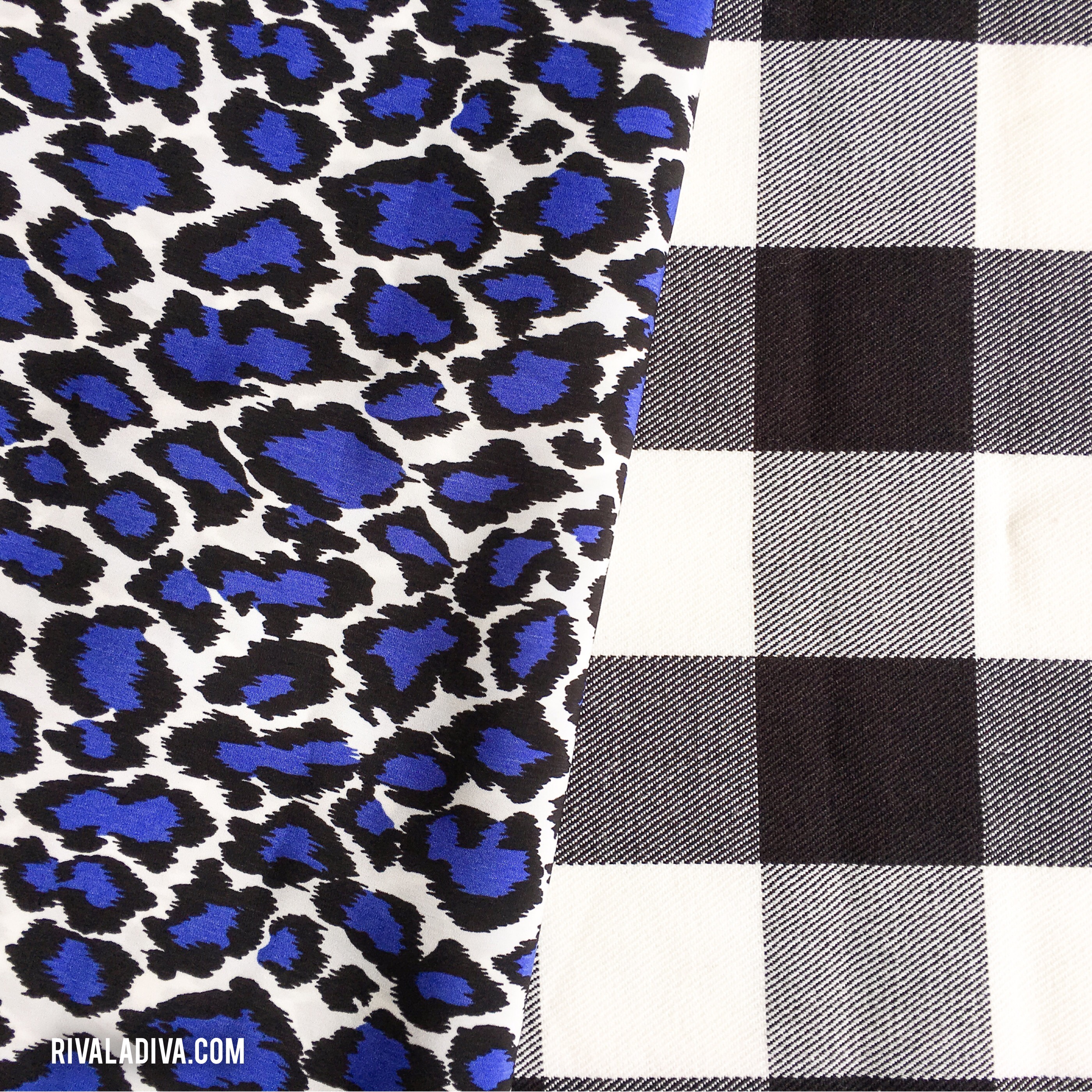
Whether you go for stripes, houndstooth, polka dots, floral, zebra, or whatever print you get your hands on, this color combo is always safe. Accessories are a more conservative way of working trends and a pop of color never hurts! I had a great example over the summer, SEEN HERE.
3. Stripes
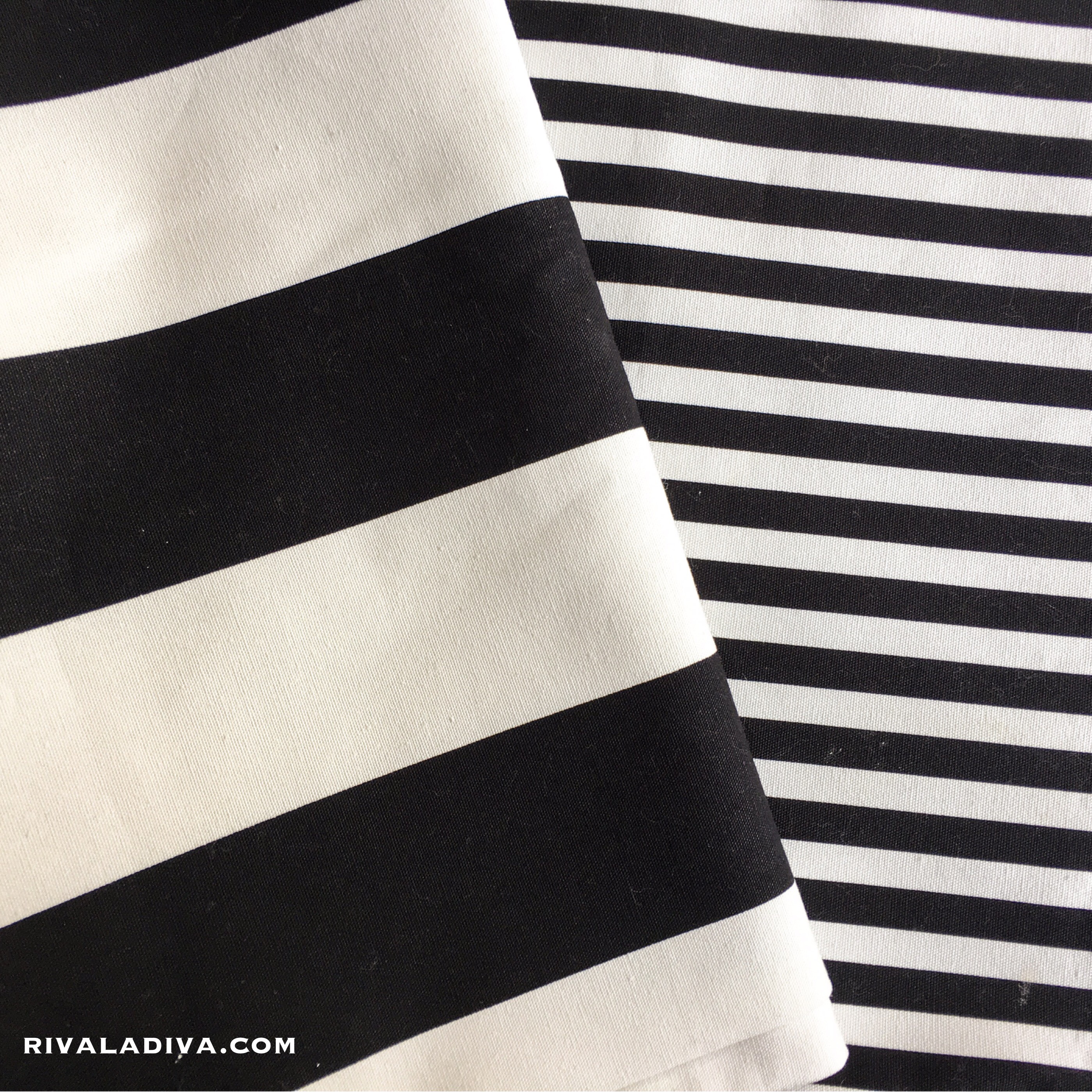
Stripes are all the rage the last few seasons and for good reason – it goes with everything. Floral, more stripes, polka dots, leopard, you name it – it works!
4. Leopard
I have always said that leopard is my favorite color and it’s still true today! As explained above, consider it a neutral and plan to wear it accordingly, it works wonderfully with plaid, polka dots, houndstooth, zebra, graphic, florals, stripes, more leopard. However, I like to stick to a natural hue when I mix it. I love finding new ways to wear leopard!
ps. The same goes for cheetah – yup, totally two different prints but the idea is the same.
5. Graphic Black and White with Whimsical Color Prints
This is slightly more daring but when done correctly it’s flawless! Again, accessories are an easy way to venture into this trend if you feel unsure, a colorful floral pops when paired with a graphic print! Adding a solid color can help keep your look cohesive. Below is leopard printed but it’s not naturally colored so I like to consider it in the print group. Pop of colors is always I good thing.
6. Complimentary colors.
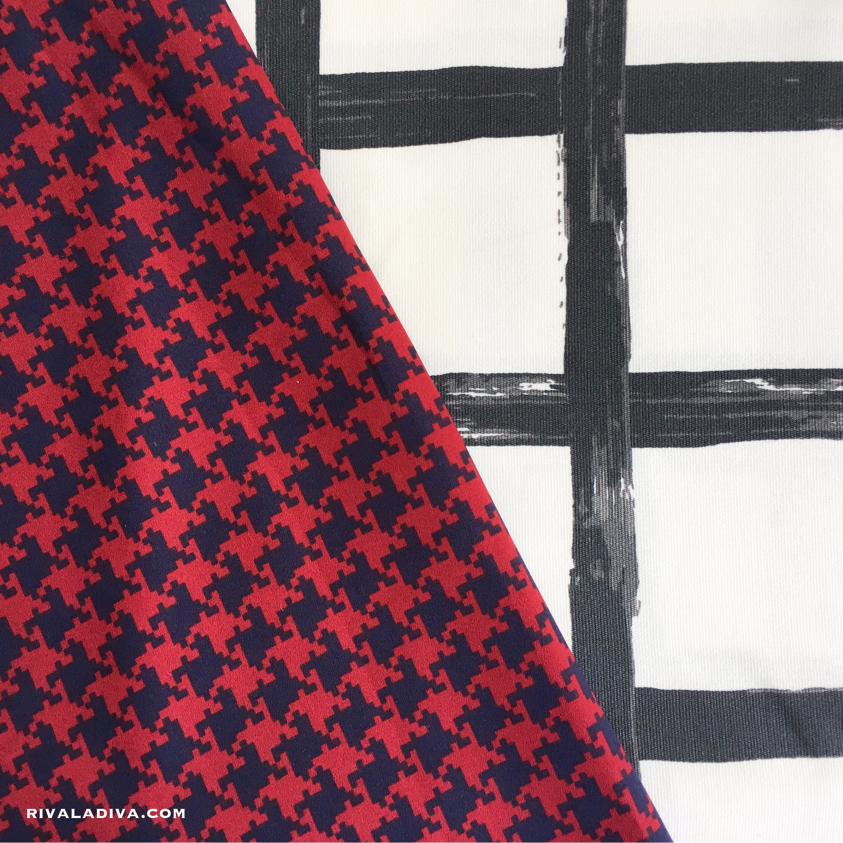
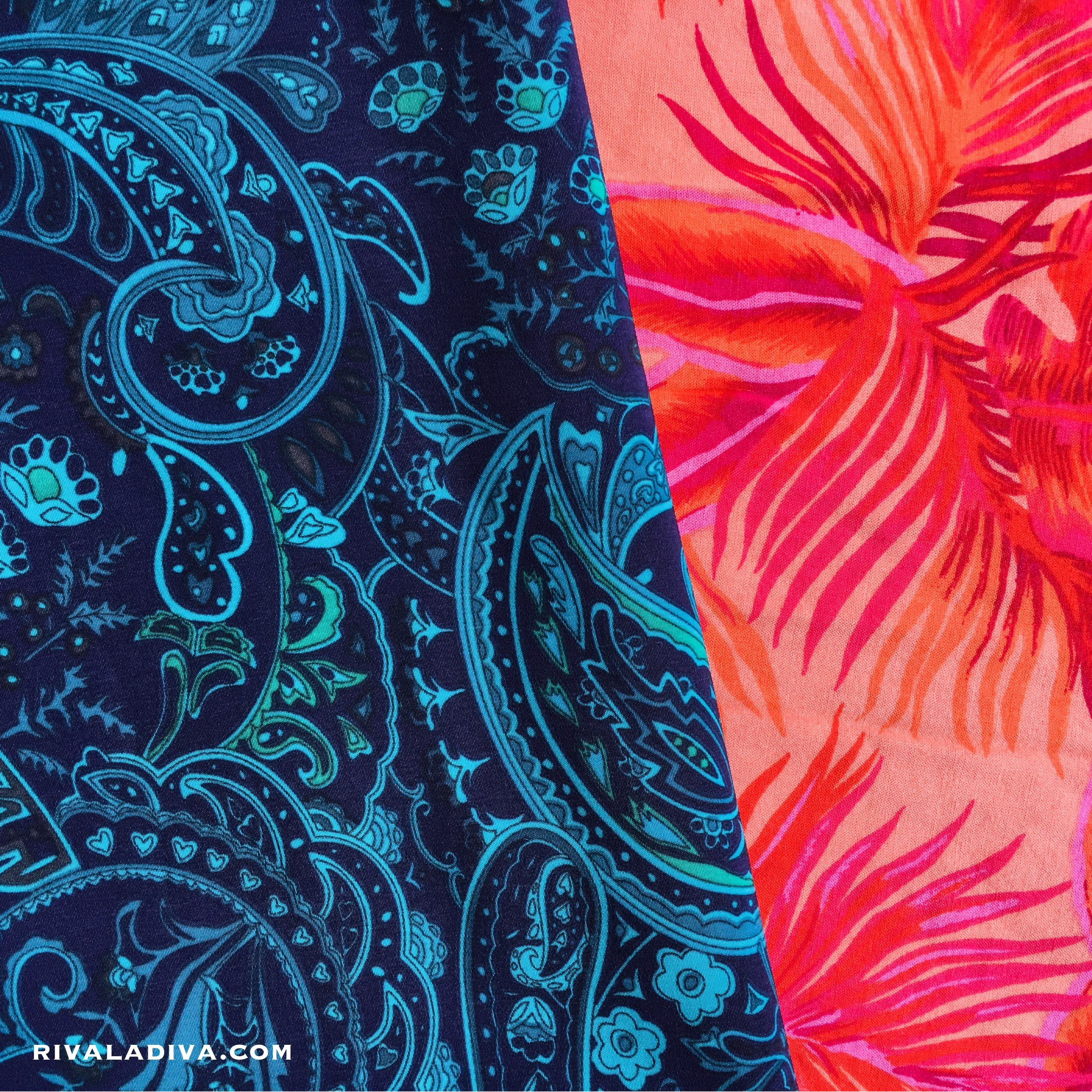
Hues in the following color combos are always visually accepting: Red and Green; Yellow and Purple; and Orange and Blue. The contrast in colors are shocking enough, so keep the prints a little on the modest side – nothing overly graphic and complicated. Most are afraid to venture into this world, but I get the most compliments when I give this trick a try.
7. Scale
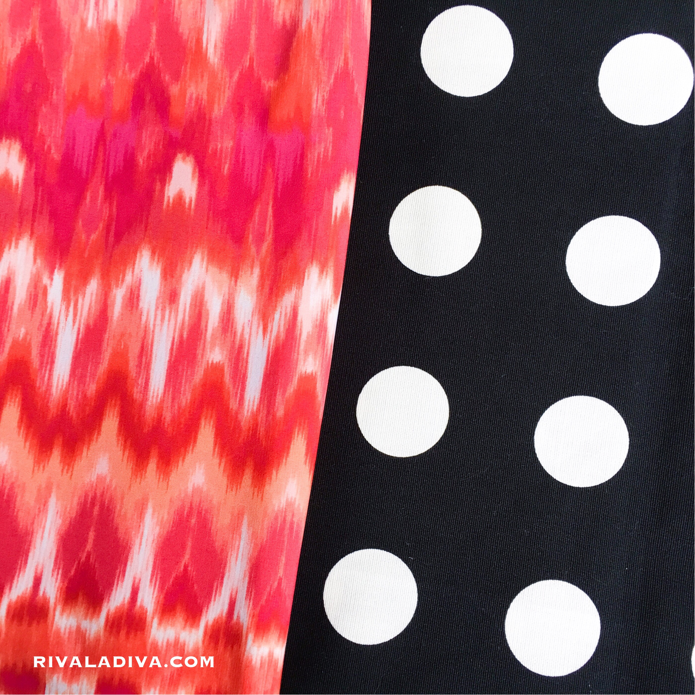
Mixing a large print with a smaller scale or keep them the same size, eith way this is always fun to do. You can match or mismatch the colors – this combo is very forgiving, a little intimidating, but forgiving.
8. CONFIDENCE
Nothing looks more ill fitting than doubt. Yes, you are stepping out of your comfort, yes, you can pull it off and yes, you are AMAZING. How do I know? You are still reading, so thank you for taking the time and I have given you some basic. Next time, I cover this topic it will be about print mixing more than 2 colors!. xo
With a new fall season starting on friday, the excitement of “a new fall you”, “a bold you”, “a daring you”, “a try something new you this fall” or whatever it may be is in the air. So, put this on your list “to do’ and jump start one of fashion’s most exciting season ttrends. The hard work is done – so let the experimentation begin!
xo/Riva

[…] she’s written a post sharing some print mixing tips and tricks – check it out here. Thanks […]
I love this post! I adore mixing prints but it takes me forrrever to find a combination that works. I like to say this is why I have to have such a big stash, to have options for print mixing. Haha!
Well said Riva!
When I get my sewing time back,, this advice will be so helpful! Loving the combos your show here 😍. Thank you!!!
xo Geni